It’s nothing new. People have been banner blind long ago. Creating banners that get clicks requires some skills. Today we will discuss what they are.
(Disclaimer: I’ll be using sample banners to illustrate my points. They are for educational purposes. Please don’t be offended if you are the owner/creator of these banners).
1) Headline is the magnet
Like copywriting, everything begins with a headline that attracts people’s attention.
It can be something that is thought provoking or something that can trigger people’s desire. For example,
“Guaranteed Profits From The Stock Market???”
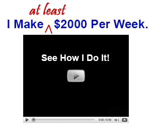
“I Make At Least $2000 Per Week. See How I Do It!”
It’s okay to exaggerate as long as you can back up what you said.
Below is an example of a banner that is too conservative. Such a banner is not likely to stir much excitement.

2) Call for action is the bait
The wordings in a banner should be kept to the minimum. You are likely to have a headline, which I’ve explained earlier, followed by a call for action.
The objective of a headline is to get people to READ. The objective of a call for action is to get people to CLICK.
So what makes people click? The trick is to create an expectation.
The call for action should give the audience something to look forward to. That ‘something’ must be so vivid that if they don’t click the banner, they will feel like they are missing out on something. For example,
“Get 20 Free Insurance leads.”
“Free Video Shows You How.”
Think out of the box when it comes to the call for action. See the example below. The call for action is an image of a video pending to be played. Some people may be so used to clicking the play button that they may subconsciously click on the button.

3) Forget about banner, think about links
People are banner blind nowadays, but they are not link blind. This means when they see words like ‘click here’, a hyperlink, a download button, or even a video play button, they click.
If you want your banner to get clicks, you need to make your banner look like a link, rather than a banner.
This is an example of a professional-looking banner.

This is an example of a link-looking banner.

Which one do you think will get more clicks?
4) Use graphics with purpose
I’m not against graphic, but we need to know what’s the purpose of using graphic in a banner. The purpose of using graphics is to gain attention.
See the example below:

Whoever looking for a holiday or cruise vacation will be attracted to see what this offer is about.
Here’s another good use of graphics, which shows the before and after of using the product.

5) Keep it simple
The last key I want to emphasize is try to keep your banner ‘clean’. Don’t pack it with lots of graphics and wordings such that at one glance, it’s hard to tell what you are trying to offer.
Here’s an example of what I mean.

The banner above is full of words and graphics. Do you find it confusing at first glance?
How about this example:

It has a good headline that will catch the attention of people having the same problem. It has also created an expectation of ‘1 secret that can lose over 40 pounds’. Last but not least, its bold design makes it stands out from the rest of the professional-looking banners. It may be ugly and simple, but I’m quite sure it gets clicks.
Banner creation is not rocket science. If you follow the above tips, you too can create effective banners.
